The word “theme park” means “vacation” to millions of people around the world, and many people choose to only vacation at places like Disney World that include plenty of thrills and all-inclusive conveniences.
With theme park attendance on the rise globally, park competition has never been more fierce, and it’s not hard to understand why.
About 252 million people visited the world's top 25 theme parks in 2018, up 3.3 percent from 2017, according to a report from the Themed Entertainment Association (TEA) and the Economics practice at AECOM.
And for the first time ever, attendance at themed attractions operated by the major companies exceeded half a billion visits in 2018, data shows.
Disney has scooped up intellectual property left and right in the past decade to play to this trend, such as opening Star Wars lands in the past year and buying Marvel. Universal Studios has also built new parks and lands including The Wizarding World of Harry Potter that attract generations of die-hard fans.
The never-ending stream of content across social media, streaming services, and other platforms have also put pressure on parks to constantly innovate and open new attractions and offerings.
In a world where travelers expect new content quickly and on-demand, why should their appetites for theme park entertainment be any different?
4 Elements For Every Theme Park Website
Theme and amusement park goers will likely first turn to a park’s website to find out what’s new this season, so that information needs to be front and center.
Header image and copy: Park websites should have a powerful visual with their header, ideally using new rides and attractions as hooks. You only have a few seconds to grab a visitor’s attention and need to keep this information succinct while highlighting all the important details and stats.
Strong calls-to-action: A home page’s mission is to drive visitors deeper into a site to get them closer to buying your product. For theme parks, you’ll want to include call-to-actions that take visitors to packages for things like season passes and park and accommodation combo deals.
Unique benefits: Make sure to call out what makes your park unique and what visitors can get at your park that they won’t get at competitors'. Visitors can’t get back their vacation day and want to ensure their favorite rides are open and want to know how fast your fastest coaster is.
Social proof: Social proof increasingly helps visitors make purchases and travel decisions, and websites should make this easy to find. One of the best ways to show-off that new ride is to show potential visitors what people are already saying about it on Instagram or Facebook so that the wow factor you’re hoping for speaks for itself.
Dollywood Galleries Prove Social Proof Pays Off
Dollywood started putting user-generated content on its website in 2018 to enhance how it tells its brand story and put a greater focus on telling that story through a consumer’s eyes.
Within the first five months, the Crowdriff galleries on the website drove $90,000 in ticket sales, and Dollywood’s website engagement increased 25 percent.
“Just from our home gallery, clicks converted to nearly 100 transactions within a 60-day period that accounted for almost $30,000 in revenue,” said Pete Owens, the vice president of marketing and public relations for The Dollywood Company. “It’s just by using user-generated content to push them further down the funnel more quickly.”
ZIP World Lets You Instantly Book That Adrenaline Rush
Direct and instant bookings (ticket sales) are just as important for theme parks as they are for other travel sectors such as hotels.
ZIP World’s website wastes no time making you crave that adrenaline rush while also making it hard to resist a booking. The site has call-to-actions overlayed on visuals that emphasize the fun, and the videos do a great job at teasing out all the offerings and also marketing some of the events the park has throughout the year.
Events are a big driver for theme parks, particularly in the off-season (think Food & Wine at Walt Disney World’s EPCOT). The more people that attend them, the more people a theme park has to share their experience on social to show the diversity of experiences available.
The user-generated content galleries on the home page also include video and do well at showing a visitor what an attraction is like without any editing.
Silver Dollar City Usings Social Proof to Stick to Slogan
Visitors can’t miss the “One of America’s Top 5 Theme Parks” slogan at the top of Silver Dollar City’s home page.
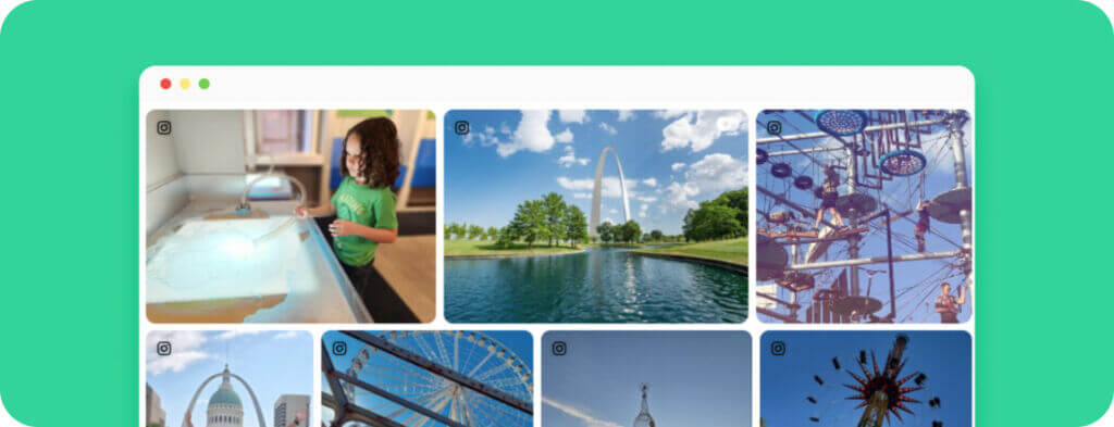
The galleries at the bottom of the home page personify the slogan and tell an all-American story of the range of activities and attractions offered. From donuts to roller coasters to Western demos, it’s all there.
Silver Dollar City’s slogan is simple and something that every visitor can wrap their heads around. Who doesn’t love a good superlative? Parks that use one have to own it in their social proof and Silver Dollar City isn’t shy about letting visitors boast.
Disney Makes Every Visitor Feel Important
Disney knows how to market a theme park. Aside from being an American icon, it also makes each of its theme park visitors feel like they’re the stars of the show.
The Walt Disney World site is heavy on video and call-to-actions, and all of its visuals represent how visitors of every age and background can find those magical experiences the mouse is known for.
There is also some personalization on the homepage that eventually funnels visitors to a customized vacation package built just for them based on their park, dining, and accommodation preferences. These call-to-actions engage the visitor in mapping out their vacation even if they don’t realize they’re doing it. Within seconds visitors have an entire vacation plan that didn’t require any personal information and see that Disney vacation planning is easy.
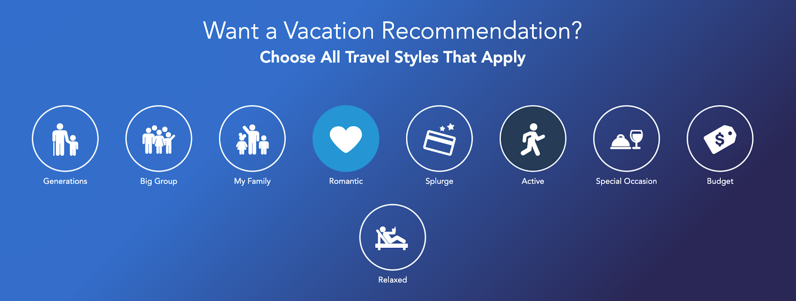 A personalization widget on the Walt Disney World homepage.
Tivoli Gardens Pushes its App
Copenhagen's Tivoli Gardens has a website that’s fresh and highly visual, so much so that some of the garden photos look like they belong on the walls of any prestigious art museum.
The park is also smart to use its site to market its app, telling visitors that they can use the app to access season passes, daily events schedules, restaurants, and more at their fingertips.
Having an app creates a deeper connection between the brand and visitor, and makes it easier for visitors to plan a visit and see what other travelers are saying about particular rides. When visitors are engaging with the app, there’s a great chance their social media profiles are only a few taps away.
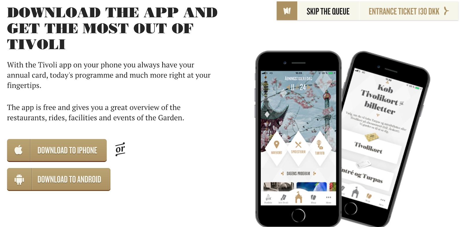 Tivoli Gardens’ app download call-to-action on its homepage.
Keeping Theme And Amusement Park Sites Relevant
Because millions of people associate a theme park with their annual vacations, parks have to design their websites with their target audience in mind just like any other travel brand.
Know your percentage of overnight guests versus day-trippers and make sure your website content speaks to both of those groups.
Remember that travelers’ appetites for new content and products have never been more insatiable. Theme parks are in a good place to use the intellectual property they own to market memories-to-be-had depending on what movies, shows, or characters are trending.
Image credit: @Kenjalina Juldyzai


