Today, more than ever, a hotel website has become one of the most pivotal ways in which a potential guest sizes up where his or her next stay will be.
So, what separates a decent resort and hotel website from an exceptionally good one? Eye-catching design helps, of course, but what really makes a website stand out is thoughtful, strategic design that makes it clear and easy for someone to understand what this hotel is all about — and convince them to check in.
- Vibrant visuals for the header image so it’s clear that this hotel is making a statement.
- Sub-headlines that are descriptive and free of jargon make things that much clearer.
- Multiple calls to action — things that signal to visitors that they should book a room — are imperative to improving your hotel website conversion rate.
- Compelling and authentic visuals to go with those calls to action are another must, as is making sure the benefits of booking a stay are detailed. That means highlighting all of the amenities and details that define an experience at that hotel, whether it’s staying overnight, or just stopping in for a drink.
Which brings us to another crucial and essential element of the best resort and hotel websites: social proof in the form of guest feedback or press reviews or, better yet, captured moments from hotel guests and visitors.
Here’s a closer look at some exemplary hotel websites that manage to weave in the essential elements that the best sites display:
Hotel X: Marketing The Hotel As A Destination
In hotel marketing today, the goal is to sell the property as more than just a place to stay. It’s a destination itself, rather than just a stop along the way.
From the moment you first see Hotel X’s site, the visuals illustrate what it’d be like to stay there with stunning photographs of the property and its many amenities, which include two libraries, and art gallery, a rooftop pool, and a sky bar, to name a few..
Another reason why this particular hotel site is so successful, too, is that it appeals to demographics of every age; it makes any visitor to the site feel like they’d be welcome at the hotel.
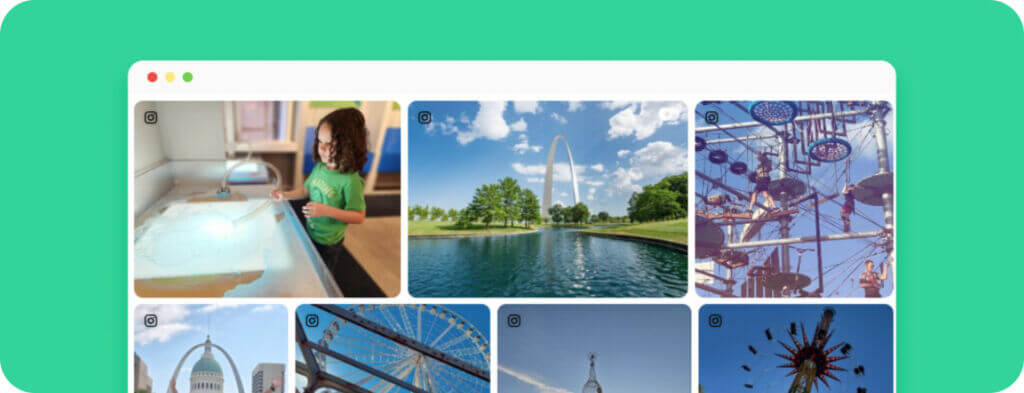
Driving you to book a stay and continue to explore the site are soft, secondary calls to action that lead site visitors down the funnel, which also includes a gallery of photos from hotel guests and visitors alike. Some of these calls to action lead visitors to a reservation page, imploring people to book.
Arizona Biltmore: A Superior User Experience
The website for the historic Arizona Biltmore lives up to its reputation with lush visuals befitting a luxury hotel.
But what makes this site particularly appealing and easy to navigate is the personalized experience bar, which offers a variety of suggested experiences for excursionists, families, retail junkies, gourmands, among others. Not only does the site allow the hotel to showcase itself, it emphasizes all of the experiences and special moments you can have during a stay, which can often be a challenge for other hotels to communicate.
The map, guest testimonials, and the expansive user-generated content gallery highlight those experiences perfectly.
Cabot Links: Compelling Visuals and Conversion Driven Design
One of the first things that you notice when you visit the website for Cabot Links is the dramatic drone footage of the property, encompassing everything the resort has to offer, from the golf courses to the beach to the golf villas.
The resort also takes full advantage of customized user-generated content galleries that specifically relate to all of the featured activities and experiences that you can have at Cabot Links. The “Food & Drink” page, for instance, has a gallery of guest and visitor photos showcasing their dining experiences, and the “Wedding” page has a gallery of numerous ceremonies and celebrations. With each of these galleries and pages, Cabot Links is illustrating that it’s more than just a place to golf — it’s a destination for relaxation, celebrations, gourmet endeavors, and much more.
And to top it all off, accompanying all of the visuals on the site are calls to action that lead visitors to book.
Badrutt’s Palace: Using Videos and History to Entice Website Visitors
Similarly to how Cabot Links uses incredible drone footage to show off its beautiful grounds, Badrutt’s Palace uses video visuals to illustrate the many different types of experiences you can have at this historic resort, which was first built as a family home back in 1896. Those vignettes include images of the beautiful lake, the lobby, dining experiences, and the rooms at the resort.
It’s that long and storied history that’s beautifully illustrated with a timeline of visuals in one section of the site, and as you continue to scroll throughout the site, there are plenty of calls to action, and even an easy way for potential guests to communicate directly with the resort via messaging on the site or through Facebook Messenger.
A “Social Page” celebrating the online Palace community features images from a variety of hashtags related to culinary, wellness, living, celebrations, and shopping. And making the site even easier to navigate are the descriptive header and the interactive menu bar at the very top of the page.
Gramercy Park Hotel: Easy Online Booking
The richness of this beautiful design hotel from artist Julian Schnabel is depicted perfectly on its website, which is formatted like a novel. The home page is split into chapters that continue to expand as you scroll your way down the site, and a convenient call to action encourages visitors to the site to do just that.
What this site does best is capture the drama of the hotel, but in a way that’s easy to navigate and, most importantly, to book: a “reserve a room” call to action remains a constant on every page.
In short, the best resort and hotel websites emphasize visual imagery, but do so in a way that’s easy to understand, to navigate, and best of all, easy to book a stay.
Image credit: @yagmurlee


