Over the past year, we’ve been collecting destination visitor guides from all over North America. At the end of the year we’d accumulated more than fifty.
Why?
By looking at a large number of guides at once, we could identify common trends in how DMOs are marketing to visitors. We also could learn which guides stood out and why, and share that information with our community.
What were some common themes and styles in destination visitor guides? What were some common best practices? Which ones gave us the travel bug and helped us visualize our trips?
All our insights and takeaways, we compiled into one report that includes numerous direct examples, suggestions and inspiration:
After looking through all of the guides we have on hand, there were 3 visitor guides that we especially wanted to shine a light on. All 3 are city or state level destinations but you don’t need a large destination budget or team to get inspired by the elements, layouts, and themes in these guides below.
Without further ado, here are 3 destination visitor guides we want to spotlight, and what makes them awesome!
1 | Visit Oklahoma City’s Spring/Summer 2017 Visitor Guide
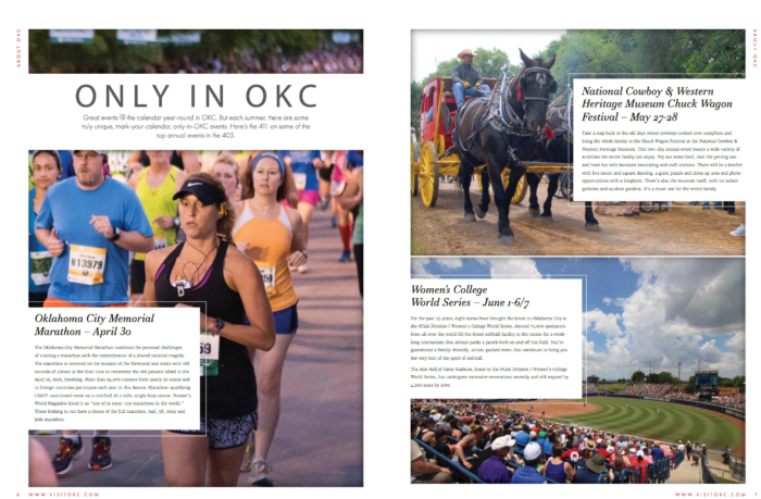
Oklahoma City’s visitor guide feels like a high-end magazine in the style of something like Conde Nast Traveler or Travel + Leisure. They’ve kept it simple and clutter-free: there is nothing in its design or content that is fluffy or extra, and every page has a clear focus. However, what really sets it apart is that this visitor guide has found the perfect balance between inspirational visual content and in-depth, informative text.
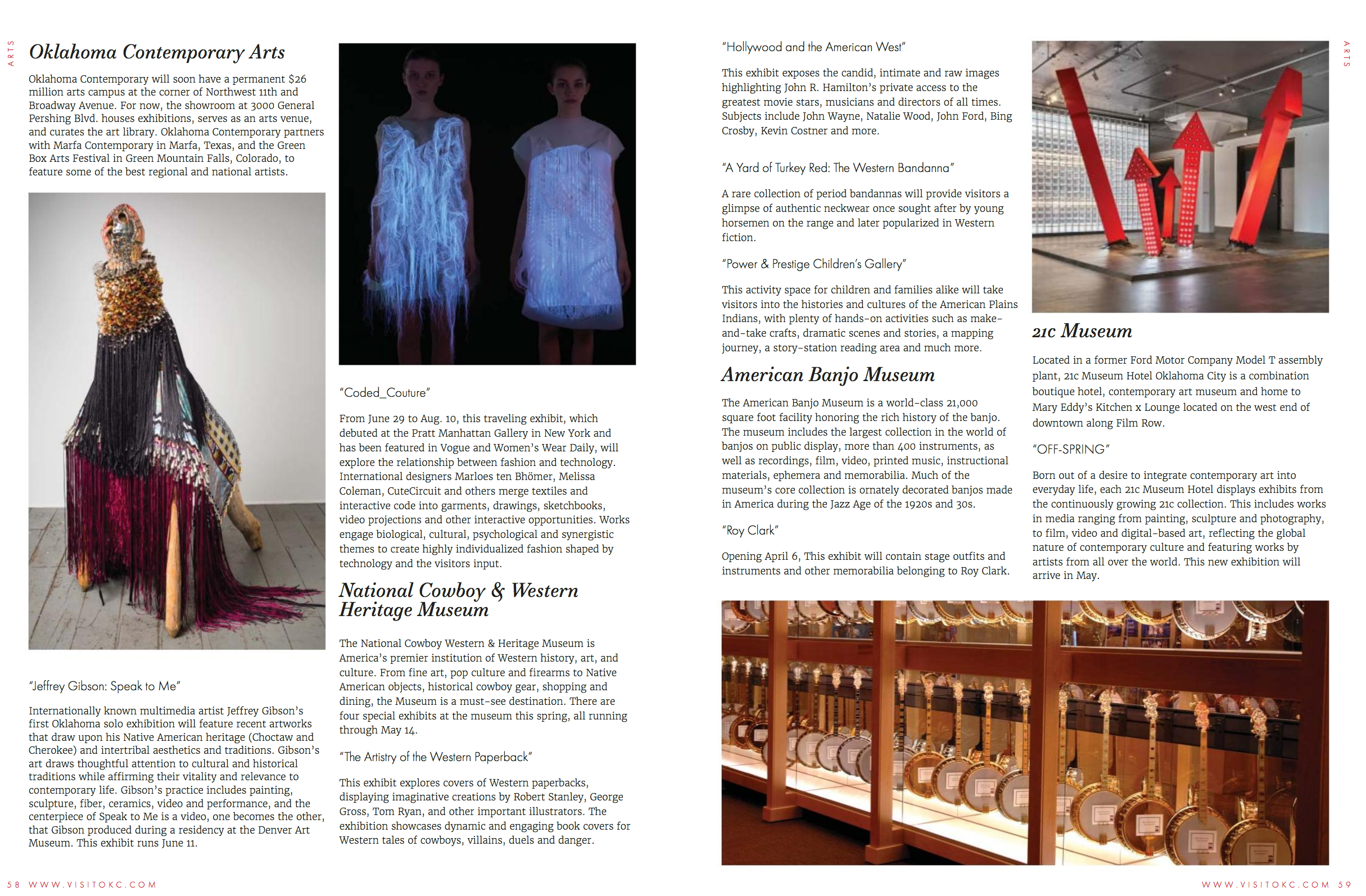
For example, in their “Art Nouveau” section, they’ve selected 5 museums to highlight. In other visitor guides, the trend is typically to list out places with a line or two describing it and another line with its address. By contrast, Visit OKC not only takes their time to describe each museum so that you understand exactly what makes it unique, they also pull out some of the exhibitions and artists being displayed there during the current season.
They also have one of the best dining guides we’ve come across:
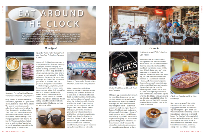
For breakfast, brunch, lunch, and dinner, they’ve selected 3 local spots to recommend, and each with a substantial blurb. And for the skimmers, at the very top of each recommendation, they’ve selected the specific menu item (and accompanying drink!) worth trying there. Because they’ve narrowed each meal down to just the top 3 choices, it feels very much like an insider’s guide.
Also, their cocktails section (punnily titled “Cokctails”) is easily one of the most beautiful we’ve seen — it looks like a spread straight out of Bon Appetit.
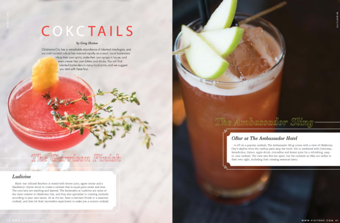
The visuals are the main star and focus and speak for themselves. Text is overlaid on the imagery, so as not to break the flow of the photo, to elaborate on the bar they’re from.
While some visitor guides seem to throw as much information as they can at you, Oklahoma City’s is a curated selection of the best they have to offer. Simple, streamlined, and effective.
2 | Travel Alberta’s 2017 Travel Planner
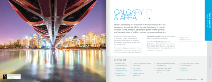
Alberta’s visitor guide is here because of the breathtaking photography throughout. Flip to any single page in this book and you will unfailingly have your breath taken away by the sheer scale of natural beauty of this Canadian province, captured in a plethora of photos that encompass the pages. In this guide, visual content is king.
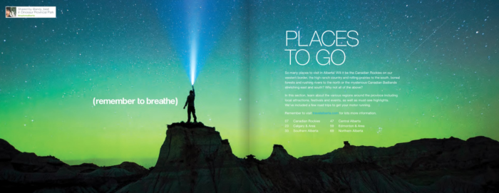
What really makes this extraordinarily visual guide a home run, however, is its integration of user-generated photography. Instead of grouping visual UGC together into “The Best Instagrams in XYZ” sections, they simply used them as standalone photos throughout the guide, in the same way they used professional photography.
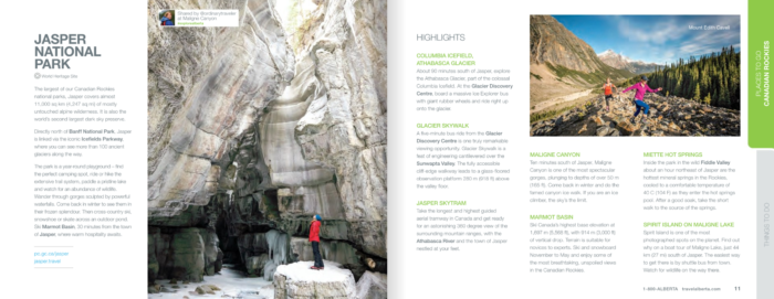
The effect is stunning. The user-generated photos are easily just as spectacular and high resolution as any of the other imagery, but also has a ring of authenticity to it. Because these photos are taken by other locals and travelers, it brings those views and sights closer to home: it’s not only a professional that can find these beautiful scenes to capture, you can too.
To help you make the most of the sights they show you here, they’ve also included multiple detailed road trip itineraries that outline exactly which sights you’ll see, and where you’ll find the best photo-op spots.
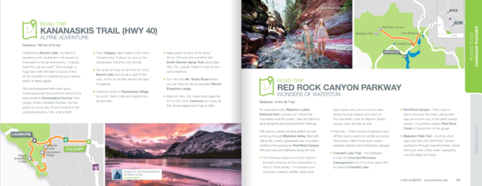
They haven’t spread themselves thin here; they know their biggest strength as a travel destination — natural Canadian beauty — and have focussed helping readers find the best of it.
Another thing this visitor guide includes that many do not is include helpful links to websites, wherever relevant. This makes so much sense, because if a reader is intrigued by something you’ve talked about in your guide, they’re likely going to go online to learn more about it anyway. Providing the link eliminates the step of them having to search for the most accurate information and as a whole makes this guide actionable as well as inspirational.
3 | Tourism Toronto’s 2017 Toronto Magazine
Many DMOs are trying to reinvent their visitor guides to read more like magazines. With bright colors, glossy pages, interviews, columns, and most importantly not a business directory in (plain) sight, Tourism Toronto’s aptly named Toronto Magazine hit a bullseye from concept to execution.
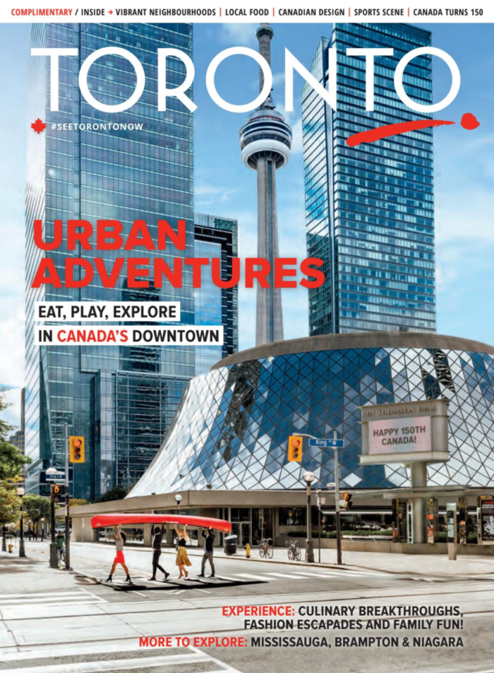
The biggest strength of this particular visitor guide is that it doesn’t just tell you were to go when you come to Toronto — this guide was able to truly capture and convey the spirit of Toronto in its pages.
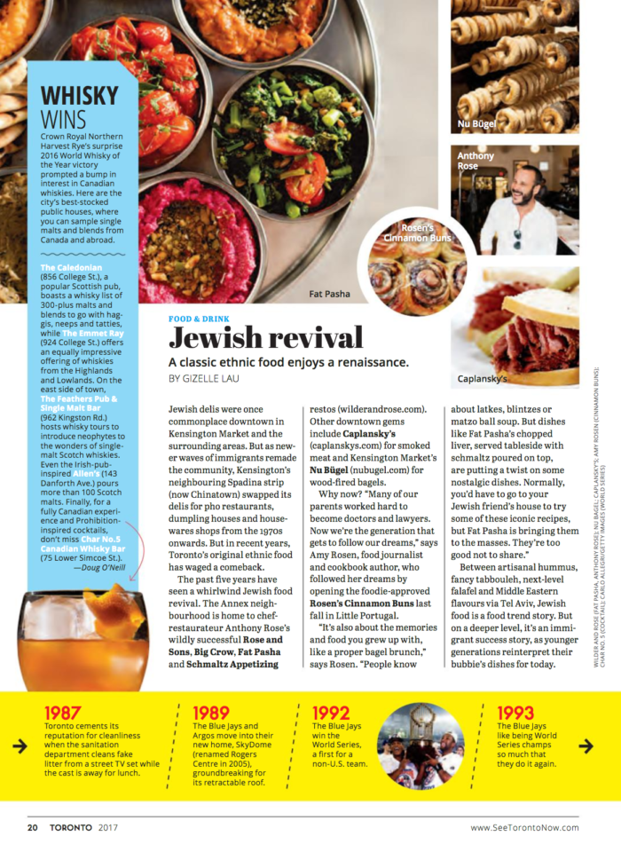
The diversity of topics covered here is a reflection of the diversity that defines the city. The festivals section covers everything from indie music to jazz festivals as well as ethnic celebrations like Caribana, and has articles on where to get the best Jewish eats or Japanese desserts.
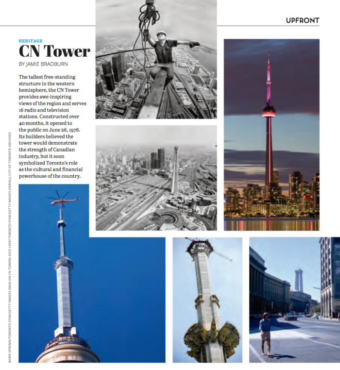
The CN Tower is iconic to Toronto — and everyone knows it. In a visitor guide it would be a mistake not to talk about it, but what can you say about it that’s uniquely different? This is something all destinations have to think about: how can you talk about your landmark in a way that brings new light to it? Tourism Toronto, instead of redundantly recommending a reader to visit and bask in the sweeping views of the city, they recount the 60-year history and making of this tower in a photo story.
This magazine also has a big focus on Torontonians themselves, and frames the city through their eyes. Included here are interviews with local chefs, who talk about the local joints they frequent, famous Torontonian fashion designers, as well as a spotlight on fashionable every day people in a cool, pull-out Street Style page.
As a reader, you get the sense that you are getting to know the culture of the city and its story. All the content is laid out in dynamic visually interesting layouts, so that each page is exciting and new.
Looking for more inspiration from leading DMOs?
We love analyzing what brands are up to and sharing our findings. Read what five forward-thinking DMOs like Visit Arizona and San Francisco Travel have done to create website content for travelers that is targeted, unique, and inspiring in our latest eBook: Making Your Website an Insider's Guide to Your Destination.


