What’s a good way to stay on top of a traveler’s radar?
Social media, of course, is one way – and then there’s your destination newsletter.
Your newsletter is the perfect opportunity to show off your destination’s highlights and keep in touch with the people that have signed up to get updates from you.
Send an amazing newsletter and these potential visitors will keep discovering more about the unique experiences your destination has to offer.
So, what’s the secret to sending an “amazing” newsletter?
The best destination newsletters are able to inspire people to come and provide the information they need to plan their next visit.
Let’s take a look at these 5 destination newsletters, and see what they’re doing right.
1 | Visit Franklin
We really like the creative use of visuals in Visit Franklin’s newsletter. Even the subject line incorporates fun, eye-catching emojis – and a lot of personality:
Fall in #FranklinTn is calling and it looks good on you!??
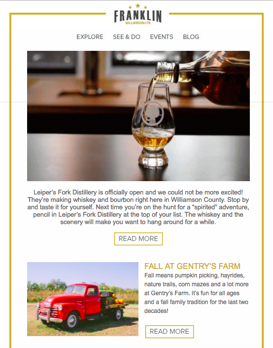
Visit Franklin has achieved a good balance between images and text: the layout gives equal weight to the visuals and the descriptions that accompany them.
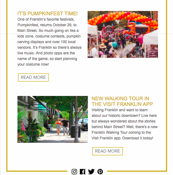
Best of all, the focal point of the newsletter is the cinemagraph of pouring whiskey at the top. The movement draws readers into the newsletter, creating a sense of realness and immediacy that brings the distillery – and Franklin – to life.
2 | Visit Jacksonville
Short and sweet, this example from Visit Jacksonville is a different kind of newsletter. The single-page layout is simple, clean, and to the point.
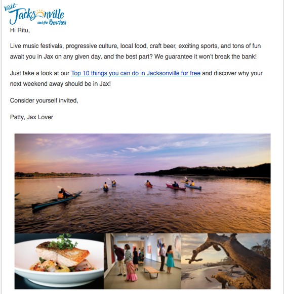
It only includes the essentials: their logo, a short message, and a single call-to-action. And the photo collage that follows speaks the rest.
Overall, this newsletter reads like a personal invitation. The recipient is addressed by name and the message is signed Patty, Jax Lover. In fact, the copy repeats Jacksonville’s nickname, Jax, three times.
Using local lingo and personal language invites your reader to feel like a special guest with insider information – especially when combined with tips about free local activities.
3 | Tourism Toronto
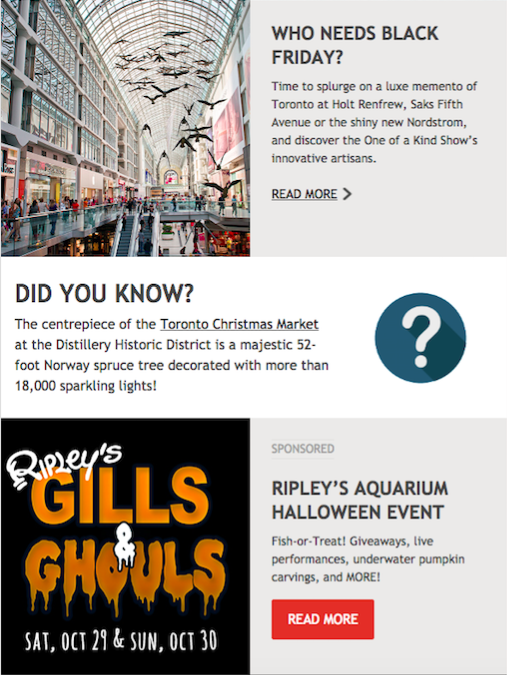
For an awesome example of how to create a more in-depth newsletter, look no further than Tourism Toronto. It’s packed full of content, but doesn’t feel long or cluttered. It includes articles, calls to book now, as well as fun facts, and upcoming events.
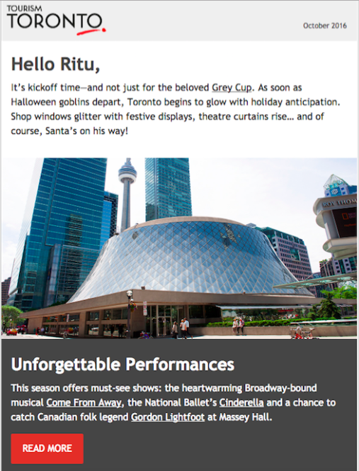
This newsletter appeals to a wide audience and showcases events ranging from the Grey Cup to the Toronto Christmas Market. Broken down into easy-to-skim sections, every piece of text is coupled with a relevant visual and a link to more information.
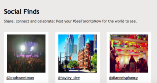
One of the best things about this newsletter is the seamless use of UGC. Tourism Toronto features “Social Finds” straight from Instagram and promotes the #SeeTorontoNow hashtag to encourage even more engagement from visitors.
4 | Visit Austin Texas
This destination newsletter is certainly easy on the eyes. All the visuals are bright, interesting, and show off the many sides of Austin’s charm.
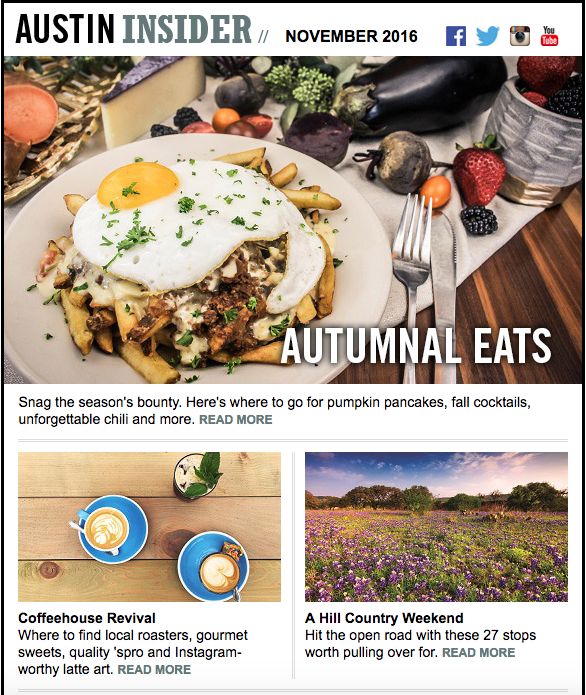
We love that a simple heading – “Autumnal Eats” – overlays the main image, both of which appeal to the reader’s craving for seasonal comfort food.
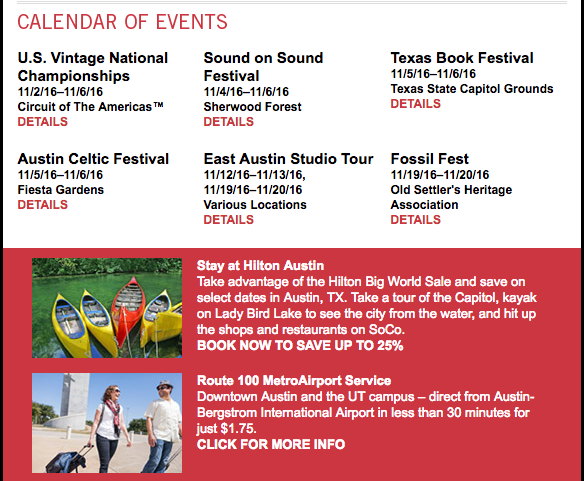
By accenting one section with a red background, Visit Austin Texas draws attention to local discounts and free activities. Highlighting event dates and details is an effective way to motivate visitors to book for a specific time.
The newsletter includes three simple calls to action: book now and save, click for more info, and plan a visit – all of which make it easy for someone to go from reading your email to planning their trip.
5 | Choose Chicago
The moment you open this email, you’re captivated with a vibrant photo of the Windy City.
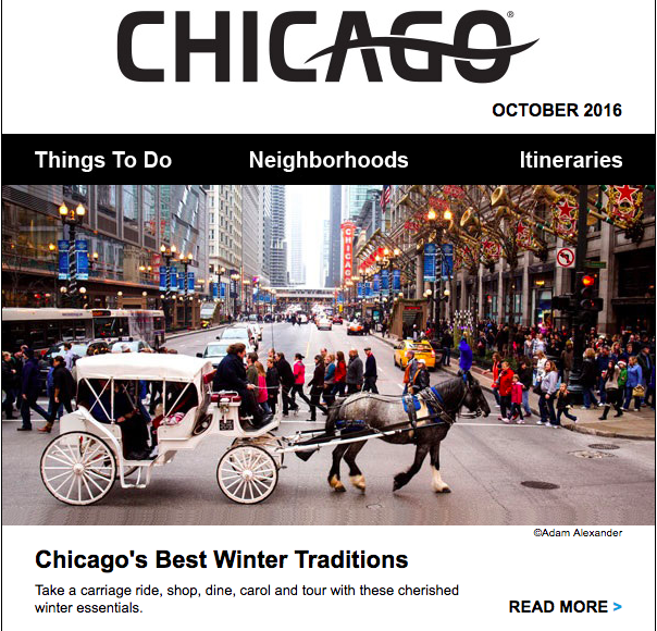
This entire newsletter is black and white, aside from the images, which really makes the visuals pop. Choose Chicago uses stunning UGC found on Instagram to promote its attractions.
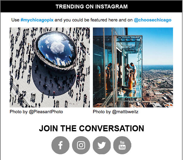
The direct call to action to “join the conversation” inspires a sense of community and visitors are asked to participate by using the hashtag #mychicagopix.
On top of being super visual, we like that this newsletter provides tons of ideas and tips to help travelers plan their next visit. It features blog posts, guides, a calednar of events, and links to deals at local businesses.
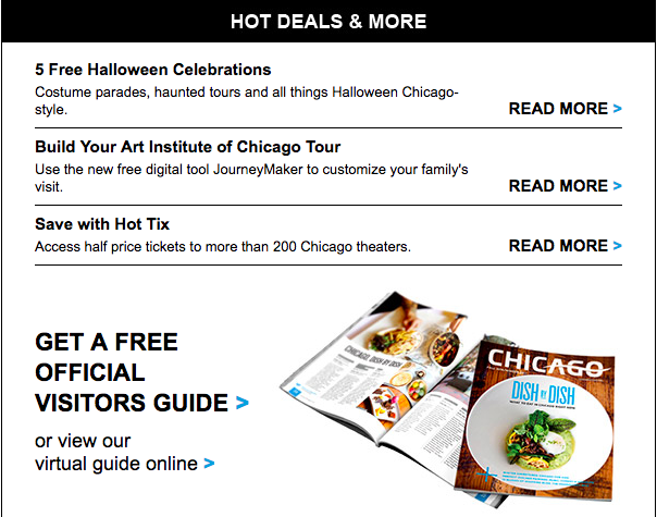
Plus, Choose Chicago offers their free official visitor’s guide for download right in the newsletter – making it easy for visitors to discover more about the city.
Takeaways for Your Destination Newsletter
Crafting an effective newsletter that inspires and excites your readers requires following the classic writing rule of “show, don’t tell.”
The best way to show readers why they should visit your destination is to start with on-brand visuals and create a newsletter around the visual experience – rather than vice versa.
Whether your destination newsletter features professional photographs, lifelike cinemagraphs, or UGC, visuals allow you to tell stories of your destination’s distinct personality, local events, and seasonal highlights.
Start with how your newsletter looks, and your readers will see why your destination is the perfect place to plan their next getaway.
