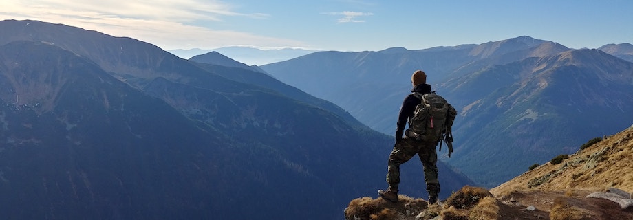
Tour operators are often responsible for what travelers remember most about their trips — the adventure, food, photo ops, and laughs — and the best tour operator websites are designed to show potential customers what awaits them on a tour rather than tell them.
A website’s text to image ratio is a balancing act, and travelers don’t stick around if it’s not right. According to a survey of 2,000 U.S. and UK travelers by GlobalWebIndex, one-third of respondents said social media content influences their destination choices more than TV, print media, or other online content.
3 Key Elements Every Tour Operator Website Needs to Inspire Travelers
Besides fancy bells and whistles of any effective website, tour operator websites also need:
- Transparency
- Responsive and mobile-ready features
- Online booking
Before booking, a traveler wants to feel reassured after visiting a website. User-generated content (UGC) and reviews from platforms such as TripAdvisor go a long way on this front.
Does your website have one or several elements of social proof? And are the visuals on your site showing unique experiences that few other operators could provide?
User-generated content is quickly becoming a must-have for tour operator websites today: Eighty-five percent of travelers find it more influential than brand photos or videos. Based on the elements above, here are the best tour operator websites to inspire you in 2019.
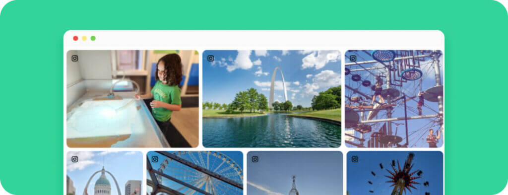
Haka Tours: A Website Redesign that Immerses Travelers
Haka Tours, a New Zealand-based adventure tour provider, redesigned its website to offer more content about New Zealand as a destination that compliments tour-specific content. The company’s former website wasn’t visually inspiring and offered only clunky, text-heavy descriptions of tours, said Barnaby Lawrence, Haka Tour’s digital marketing manager.
“The initial intent was just to replace the gallery on our homepage, but now we have multiple galleries throughout the site that use content based on hashtags. The homepage showcases a mixture of all the tours you can do, and we also have individual galleries for each tour category, such as mountain biking or adventure tours.”
Since the website’s relaunch, Haka Tours has experienced a 45 percent drop in bounce rate, a 75 percent increase in page views, and 30 percent more sessions per user.

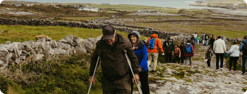
Active Adventures: Showing Every Traveler They’re Welcome
Active Adventures, New Zealand-based tour company, knows how to capture people when they feel most inspired.
Videos, written testimonials, and UGC fill the homepage. This makes sense, given that customer reviews are trusted 12 times more than marketing coming directly from brands.
What we love most about this gallery is the destination-specific CTAs. Rather than a generic “Book Now” CTA layered across every visual, they use CTAs like “View our Annapurna trip!” or “View our Bolivia trip”. This brings visitors to a new booking page where they can check availability, the trip difficulty, ratings from other travelers and related treks.
Other conversion-driven elements include a chatbot, a newsletter, and a blog.
Papillon: Keeping Call to Actions Front and Center
Papillon, a Nevada-based aerial sightseeing company, gets travelers engaged the second they land on the homepage.
With a “Choose Your Adventure” widget at the top of the homepage, visitors are instantly involved in planning their trip and taken deeper into the site where they can view more content and information about a tour.
The user-generated content gallery high up on the homepage also includes call-to-actions overlayed on the photos. If a traveler is enticed by a photo of the Grand Canyon, they can click on that photo to get more information about a tour that visits the place in the photo.
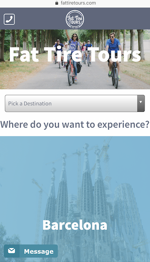
Fat Tire Tours: Mobile-Ready to Help Travelers In-Destination
U.S. and European tour company Fat Tire Tours has a website that checks many of the same boxes as the other sites, but its mobile site is also compelling and makes it simple to book on the go and keep travelers informed.
Travel websites need to consider functionality for a variety of different screen sizes for travelers to quickly access the information they need, given many tours are still booked last-minute or day-off.
Against an average of 30+ tour operator websites analyzed, Fat Tires’ site also loads much higher than average — at a rate of 1.7 seconds vs 6.3. Anything faster than 3 seconds is considered best-in-class.
Hawaii Forest & Trail: Focused on a Mission
Hawaii Forest & Trail highlights its mission statement at the top of its homepage. Every piece of content throughout the site works to inspire travelers about the mission and Hawaii’s unique natural landscape, and also makes travelers feel like they’re part of a larger story.
Turning Travelers Into Marketers
Running a tour company is difficult enough without worrying about how to market all of the offerings.
Tours and activities are one of the most complex sectors of the travel industry for all the moving parts involved in making a tour successful. But this sector is also one of the most visual and anticipated by travelers.
Harvesting real-time user-generated content for a website is one of the biggest marketing strategies an operator can adopt to create a two-way conversation that keeps a company top-of-mind for the next trip.